
As designers, we do the best we can to know these tricks of the trade and create consistent color. But will the client notice or care that their PMS corporate blue can’t be replicated when printed digitally CMYK versus 1-color offset? Do they need to know the intricacies of the printing process – RGB, CMYK, PMS, different papers and substrates – it sounds like a foreign language to most.
Some clients don’t care. Some clients care too much. As much as we can explain the reasons for the slight differences, it will never make much sense to most people. Even though digital printing is not at all new now, it still needs explanation – the method, the outcome, the pricing: “The price per piece goes down with offset printing, its ideal for quantities of 500 or more. The price per piece stays about the same for digital printing no matter the quantity.”
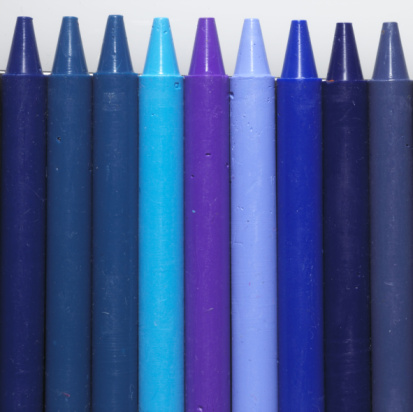
Consistent color is so important to brands that it is necessary for designers and brand managers to police this and attempt to make the assigned PMS color appear to match throughout all of its uses. But what about when a client wants a specific color to match on an electronic letterhead on their screen and on their desktop inkjet print-out? And still match on their client’s screen and corporate laser printer – it’s just unattainable. We have to manage these expectations and explain that it is nearly impossible to control all of these printer outputs and monitor settings.
All these things considered, here are some tips to maintain color consistency:
- Ideally, choose a PMS color that has a good CMYK break
- When printing uncoated versus coated, adjust the PMS – usually just adjusting one up or down works
- Beware of colors with a lot of opaque white or reflux blue in their make-up, they never look right digitally printed or process offset
- Adding a 5th color to a 4-color offset job isn’t that expensive and give you peace of mind that the corporate color will be printed accurately
- Most importantly, create a document with all the standard color variations including RGB breaks for Word, CMYK breaks, PMS coated versus uncoated, Hex colors for web – stick to it and pass it around for everyone to use as reference!